Portfolio
Some of my Latest Works!

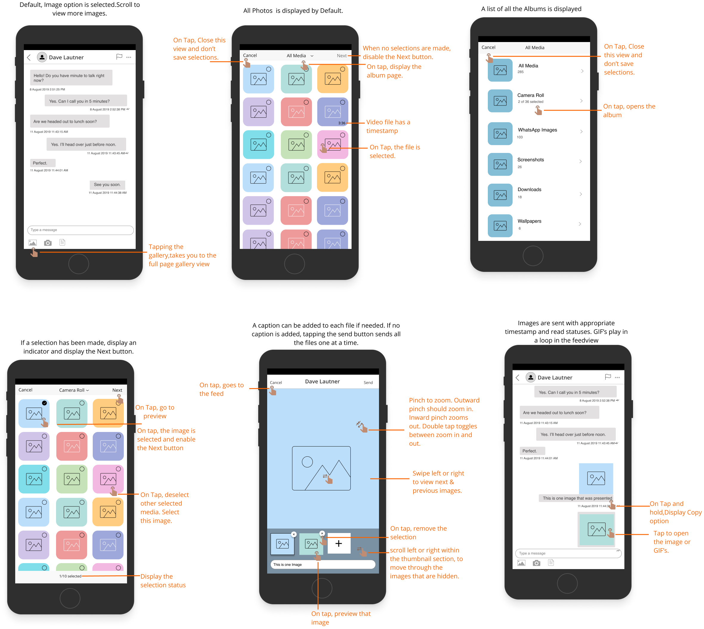
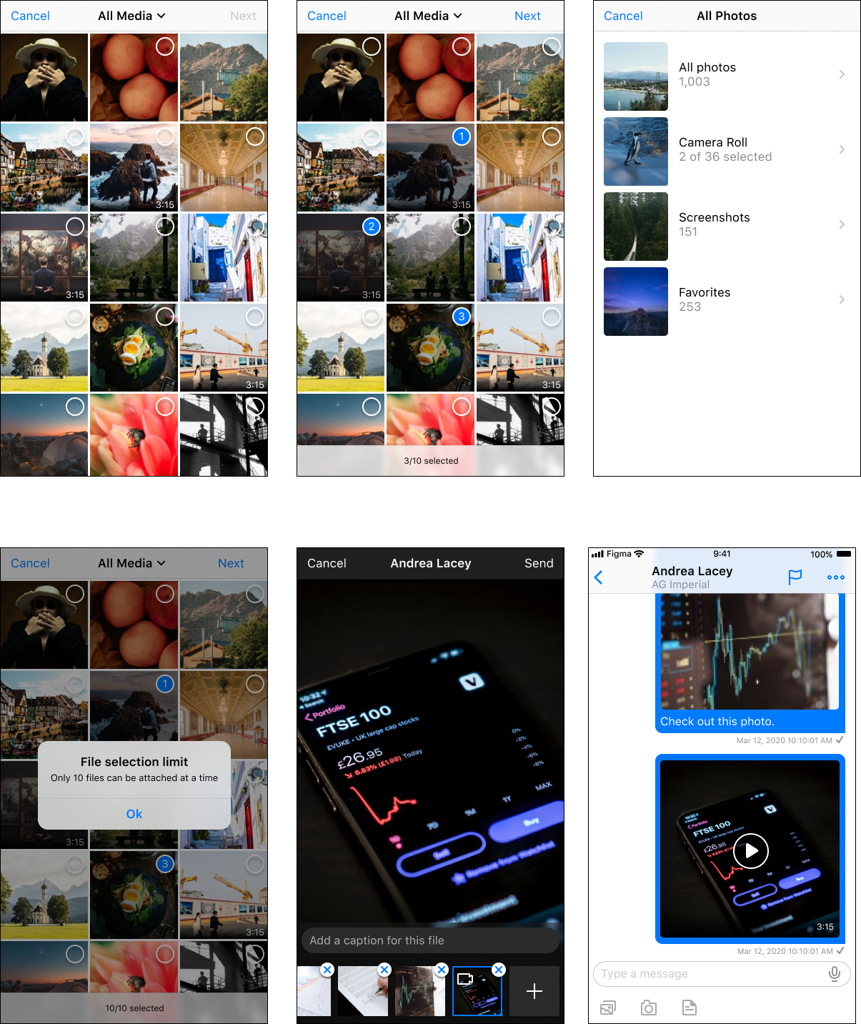
Sharing of files for collaboration
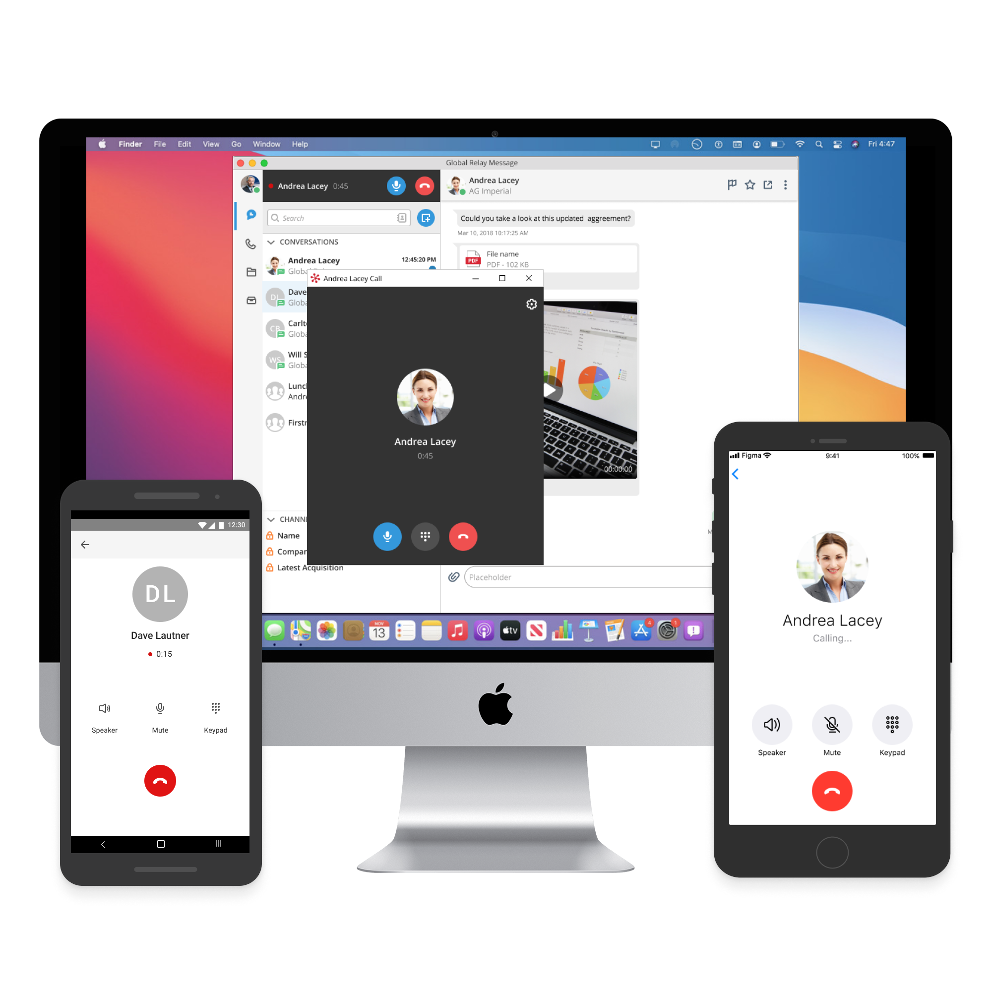
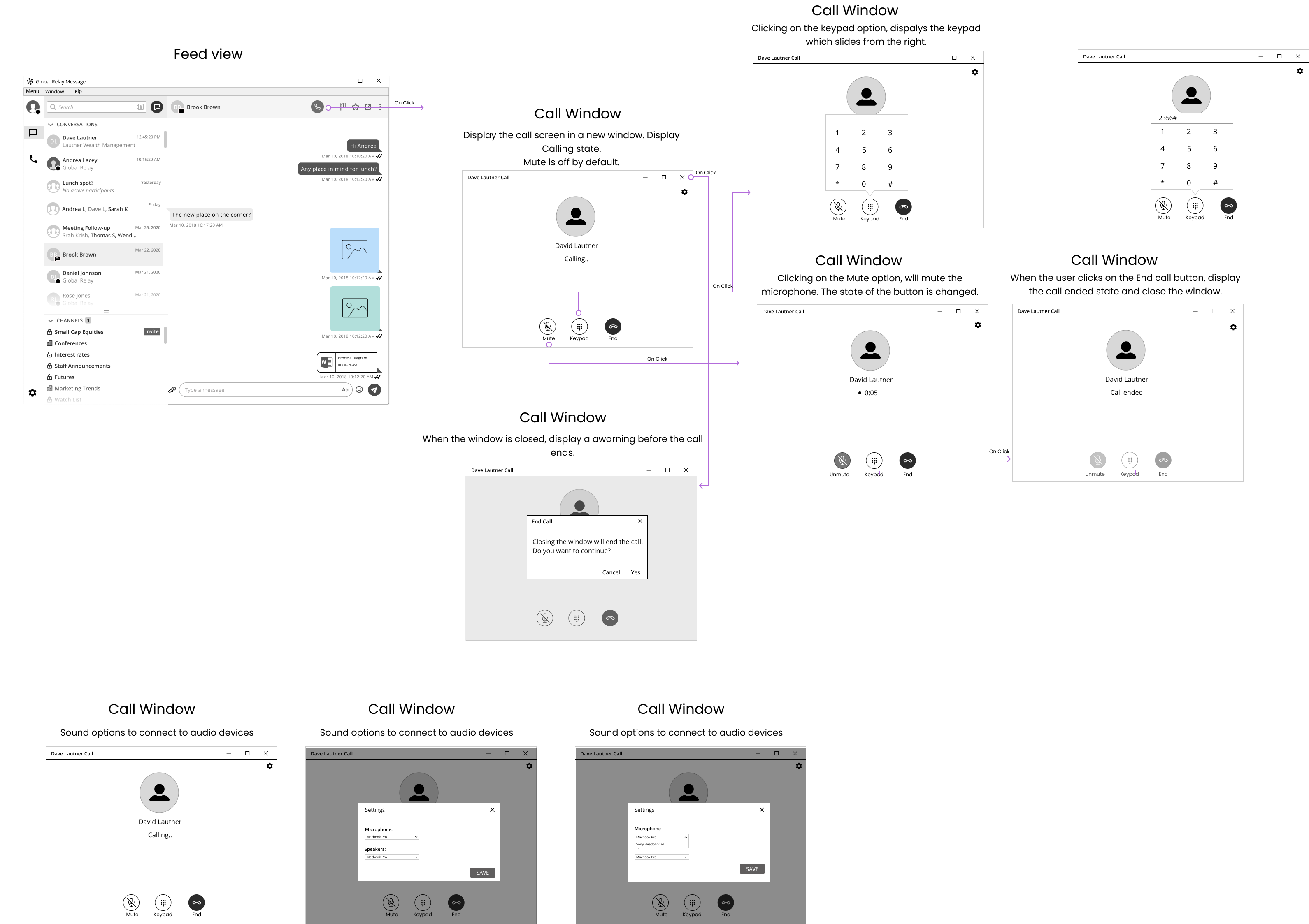
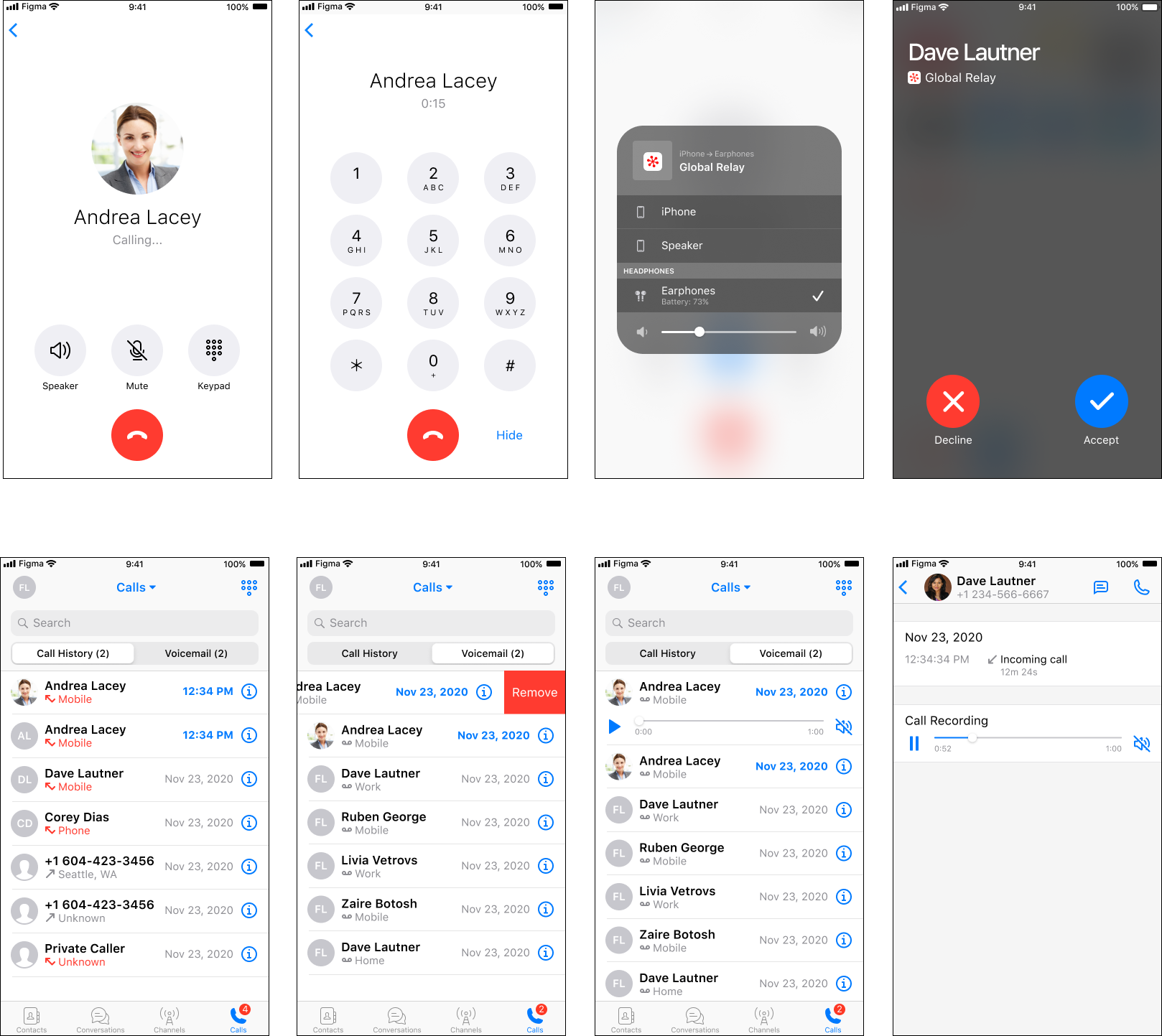
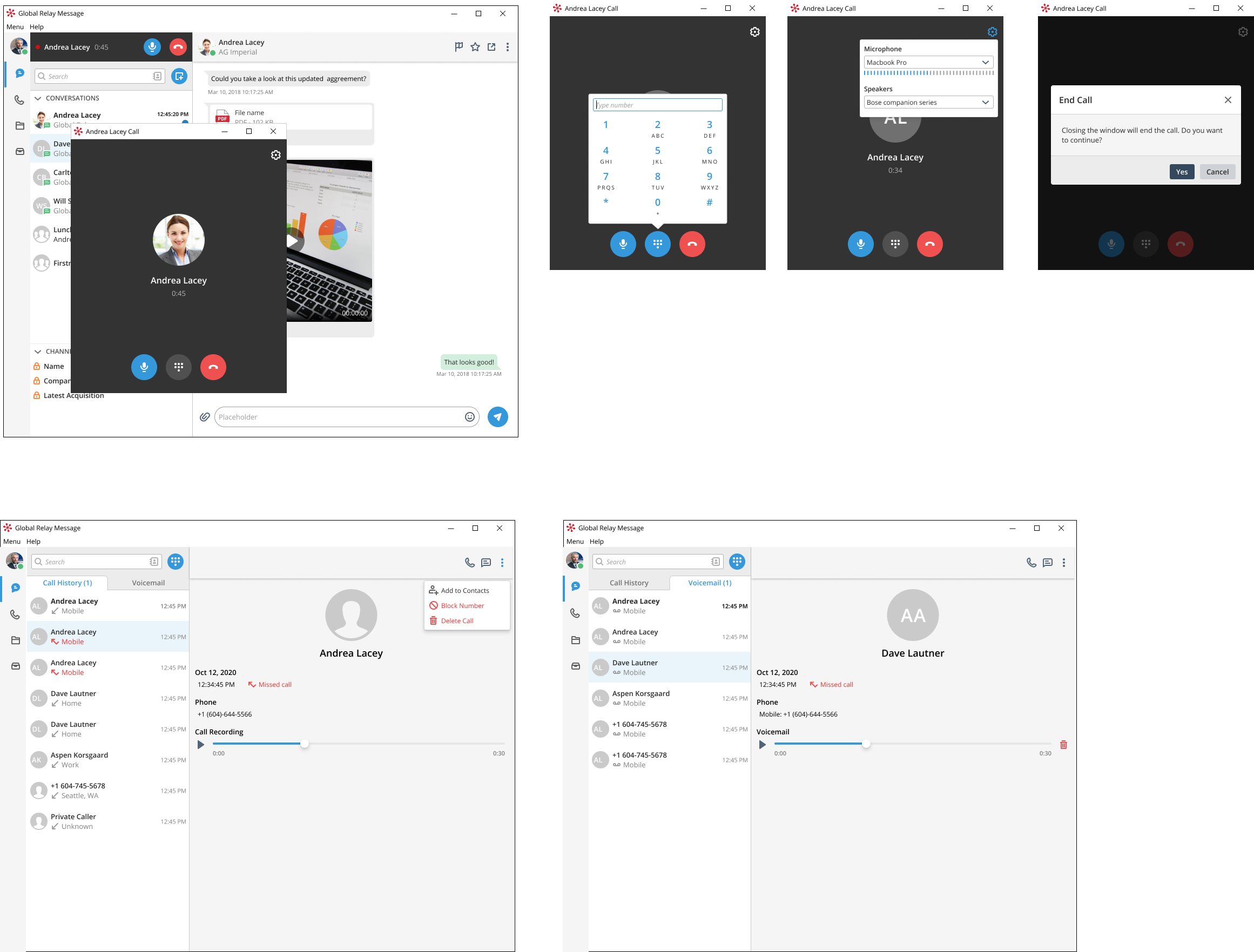
Global Relay
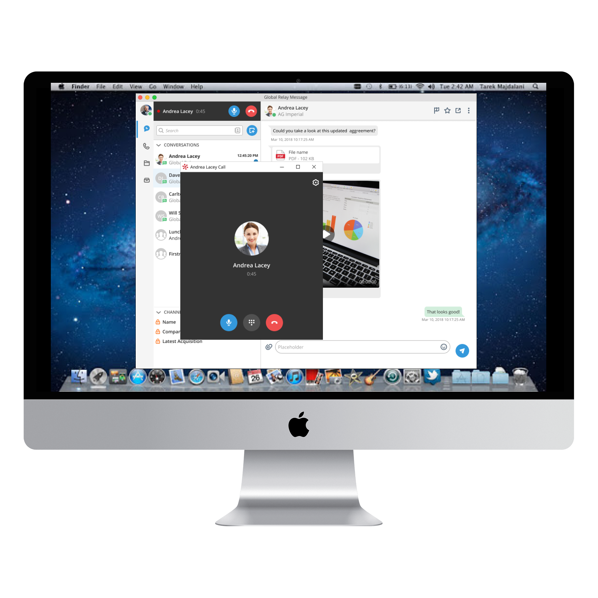
Voice call
Global Relay

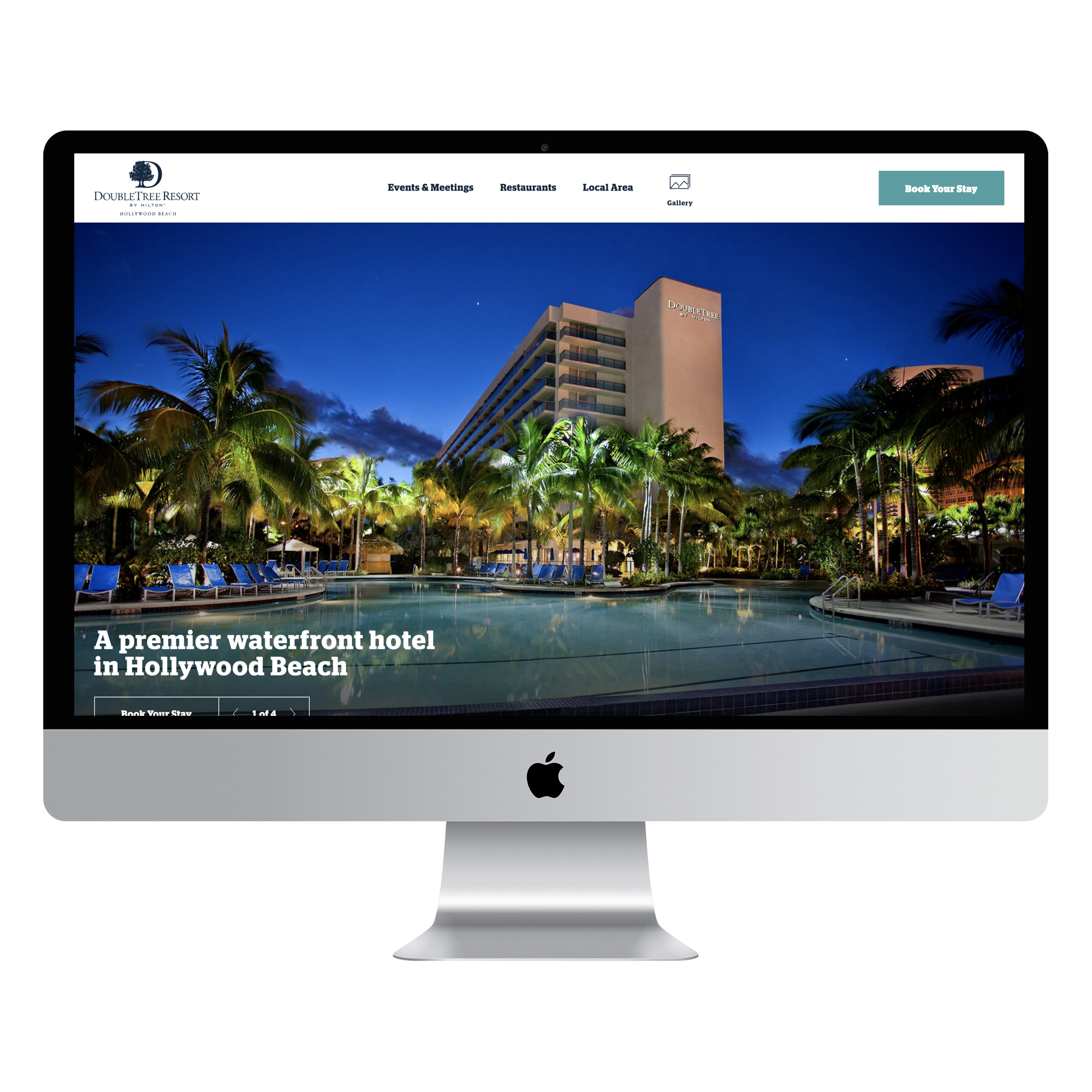
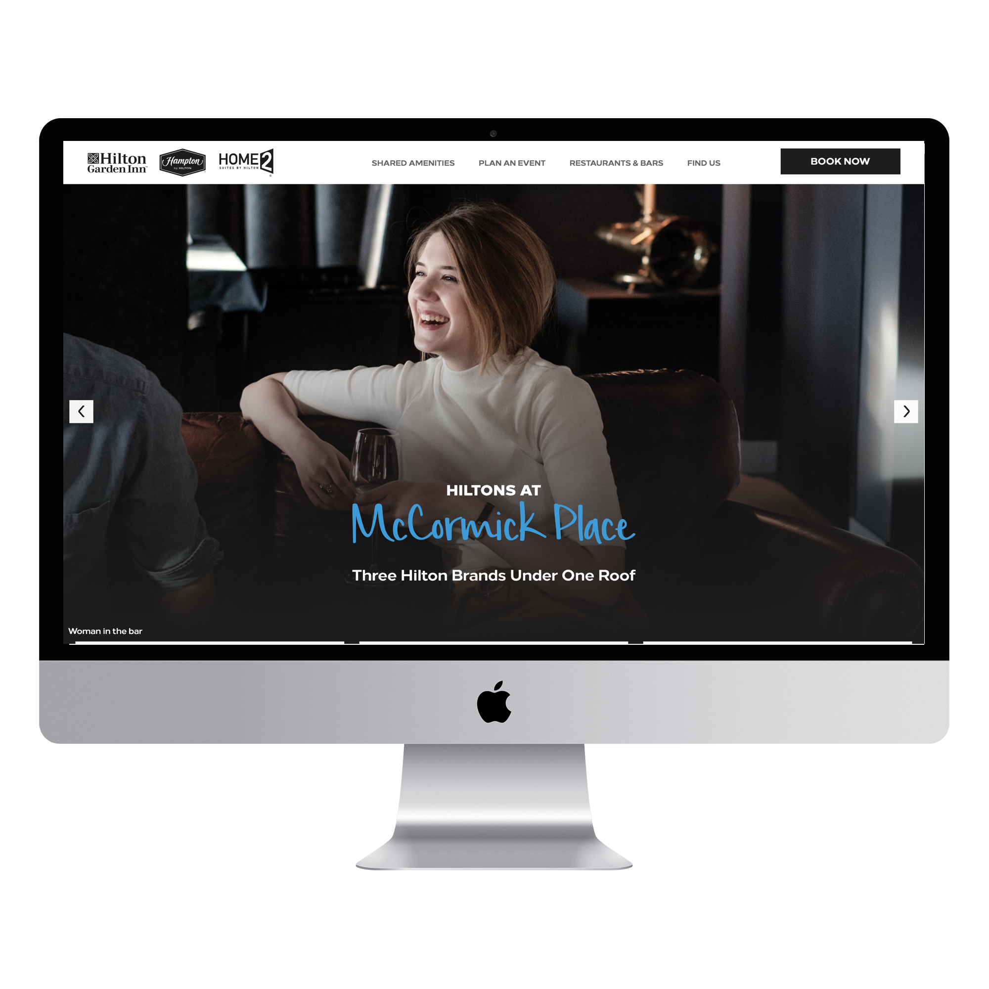
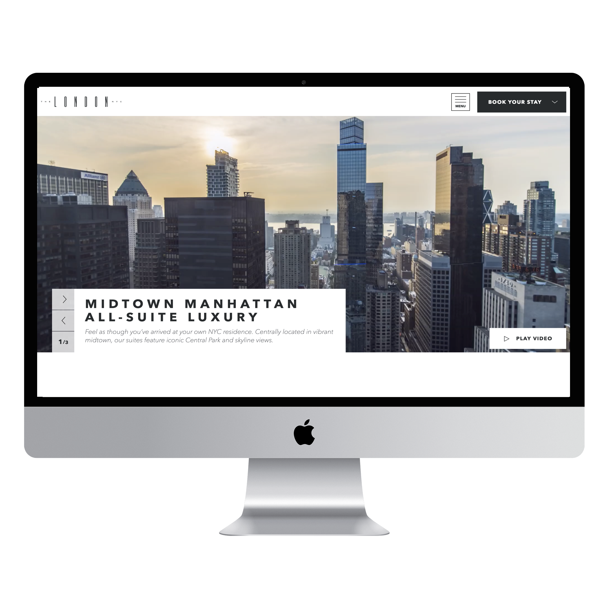
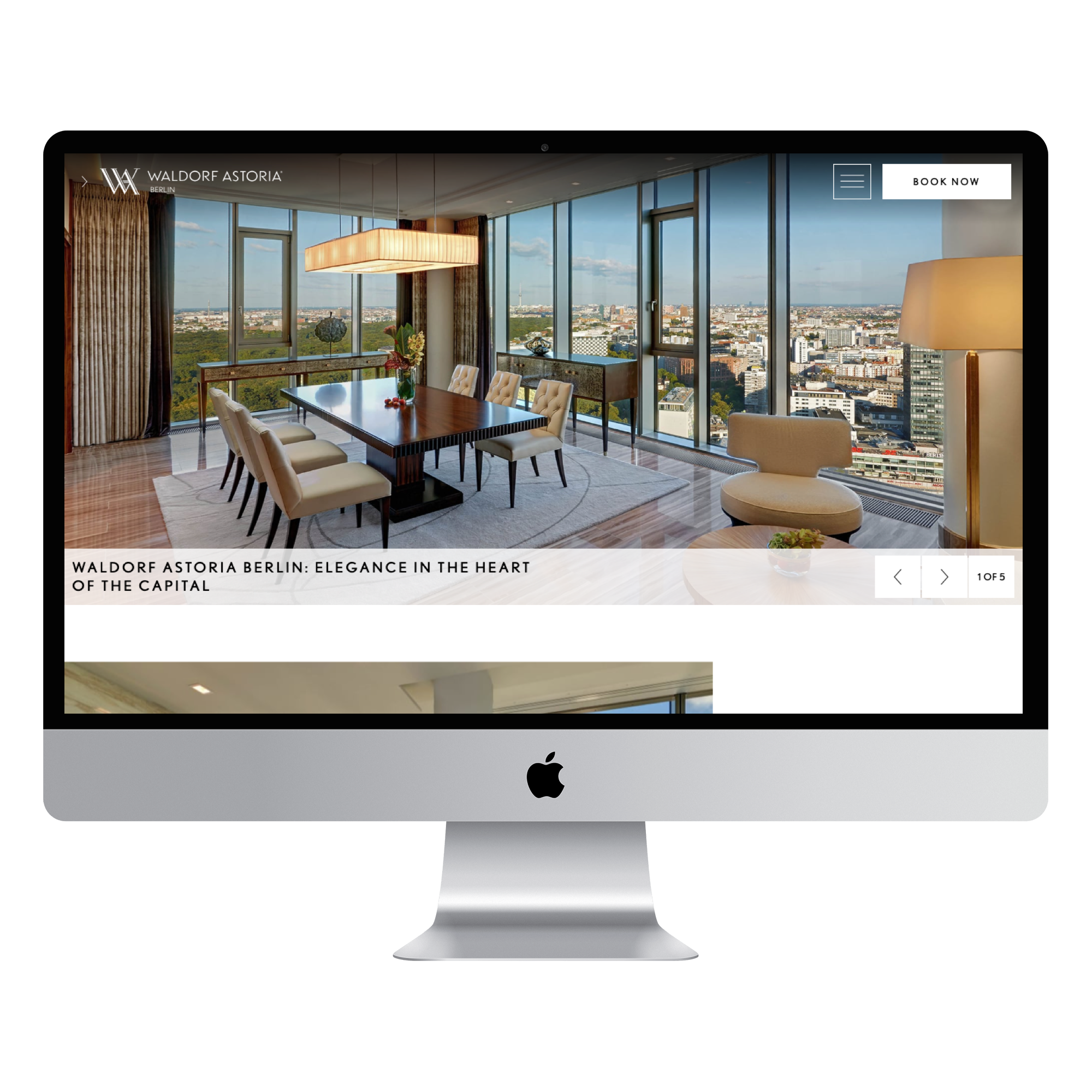
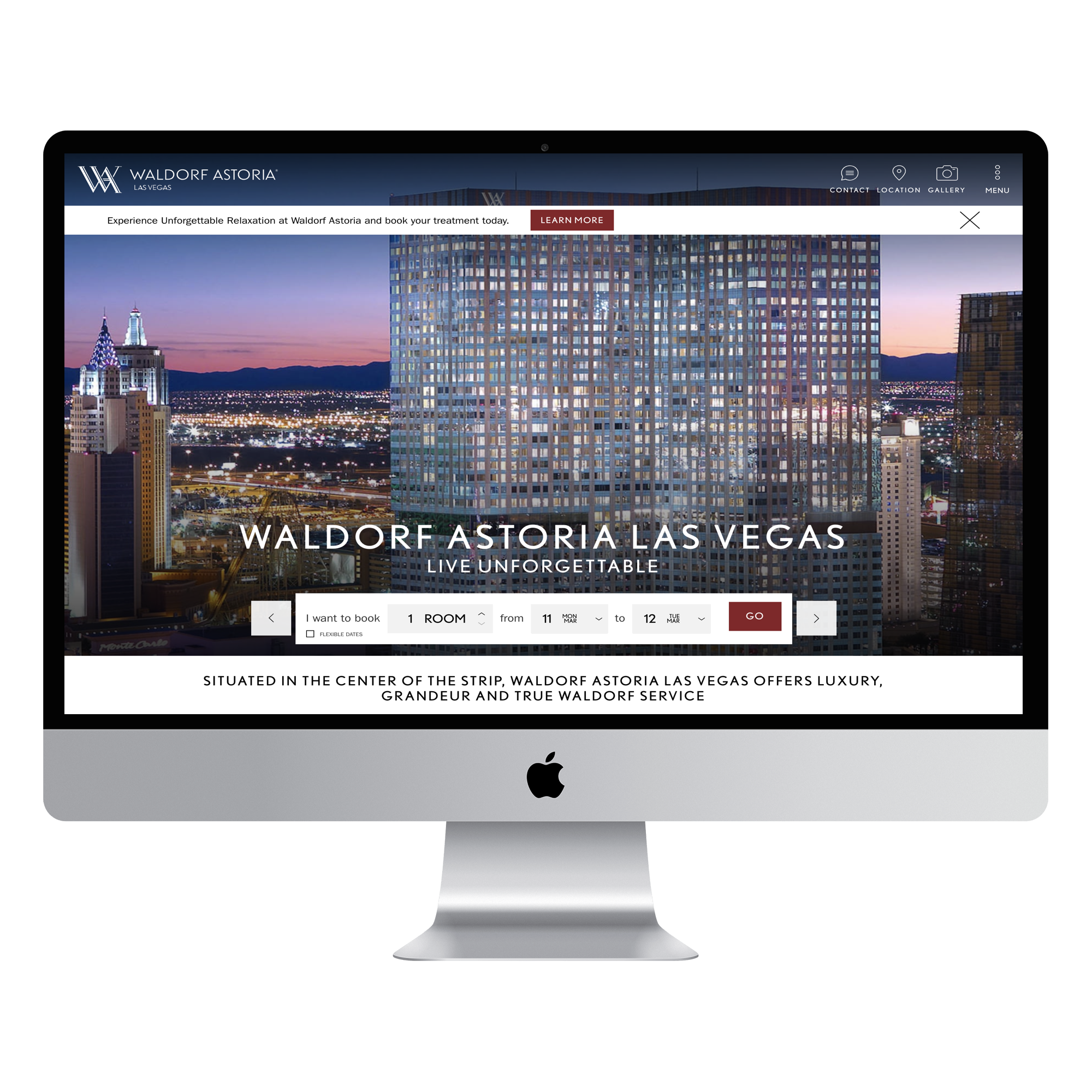
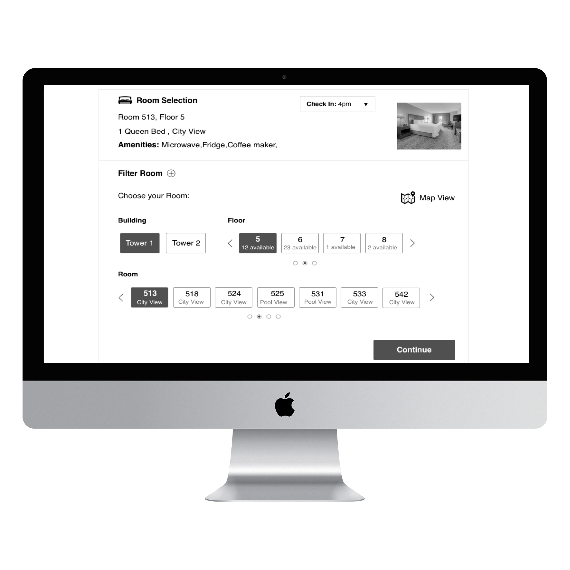
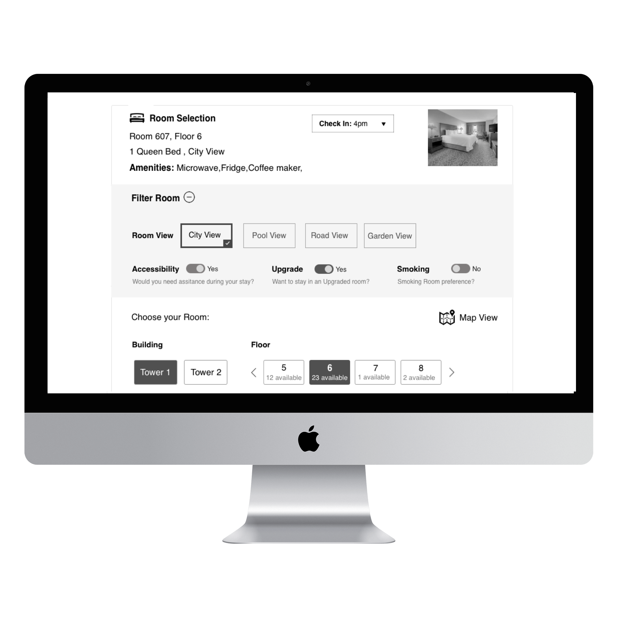
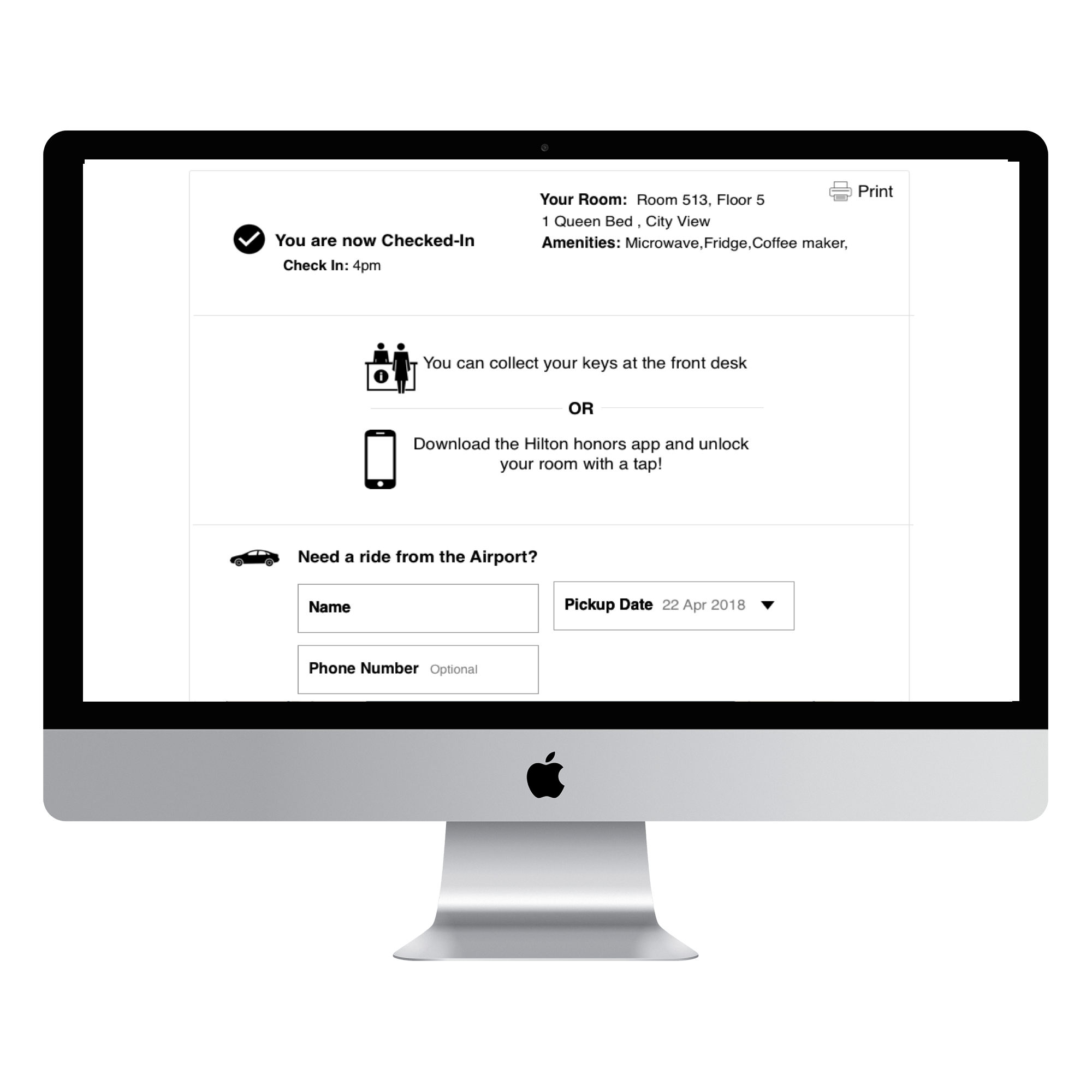
Worldwide Hotels & Resorts
Hilton
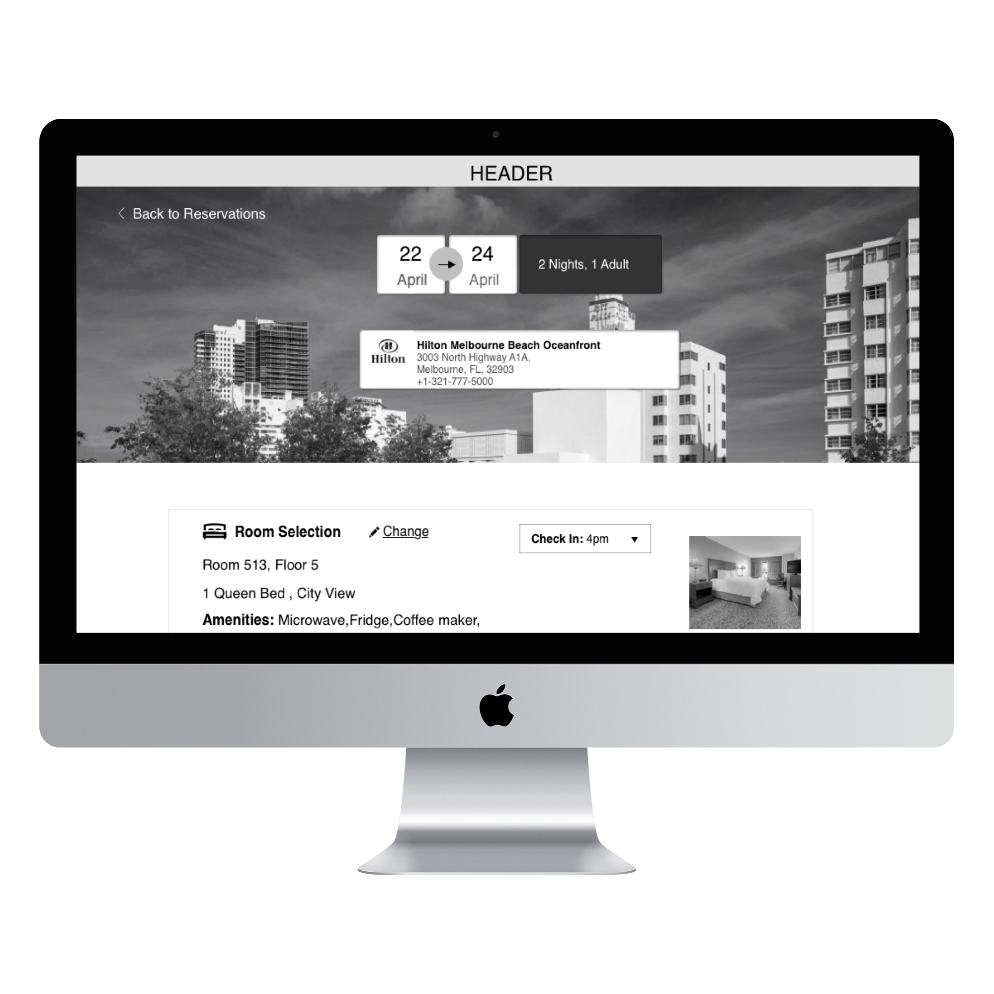
Digital Check-in Experience
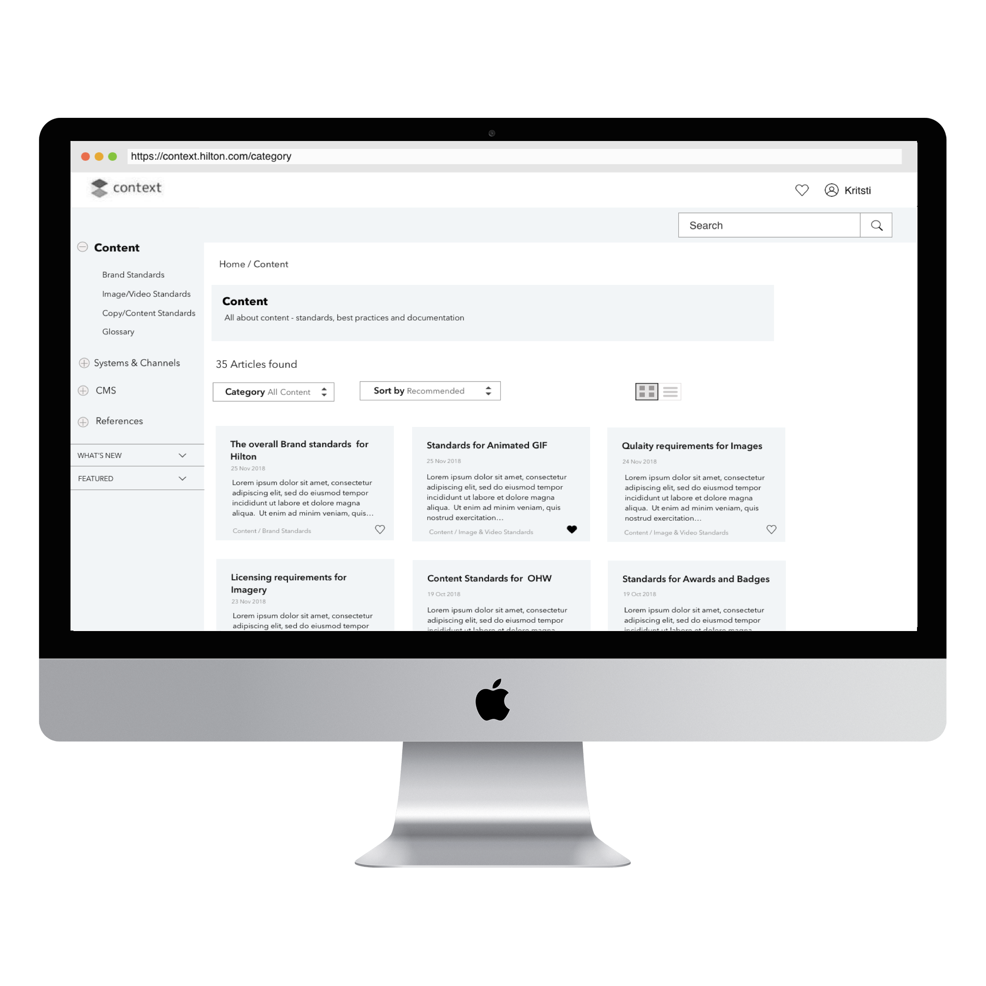
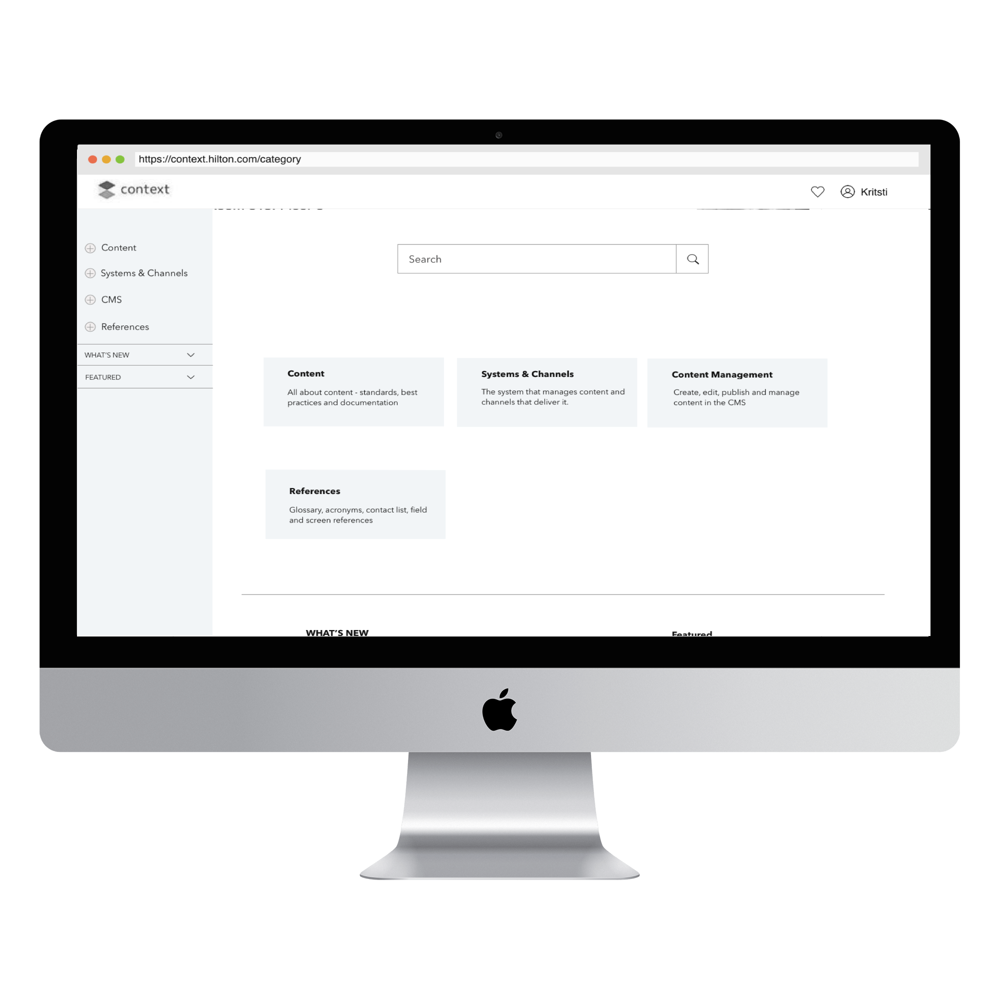
Hilton

Knowledge base Internal site
Hilton
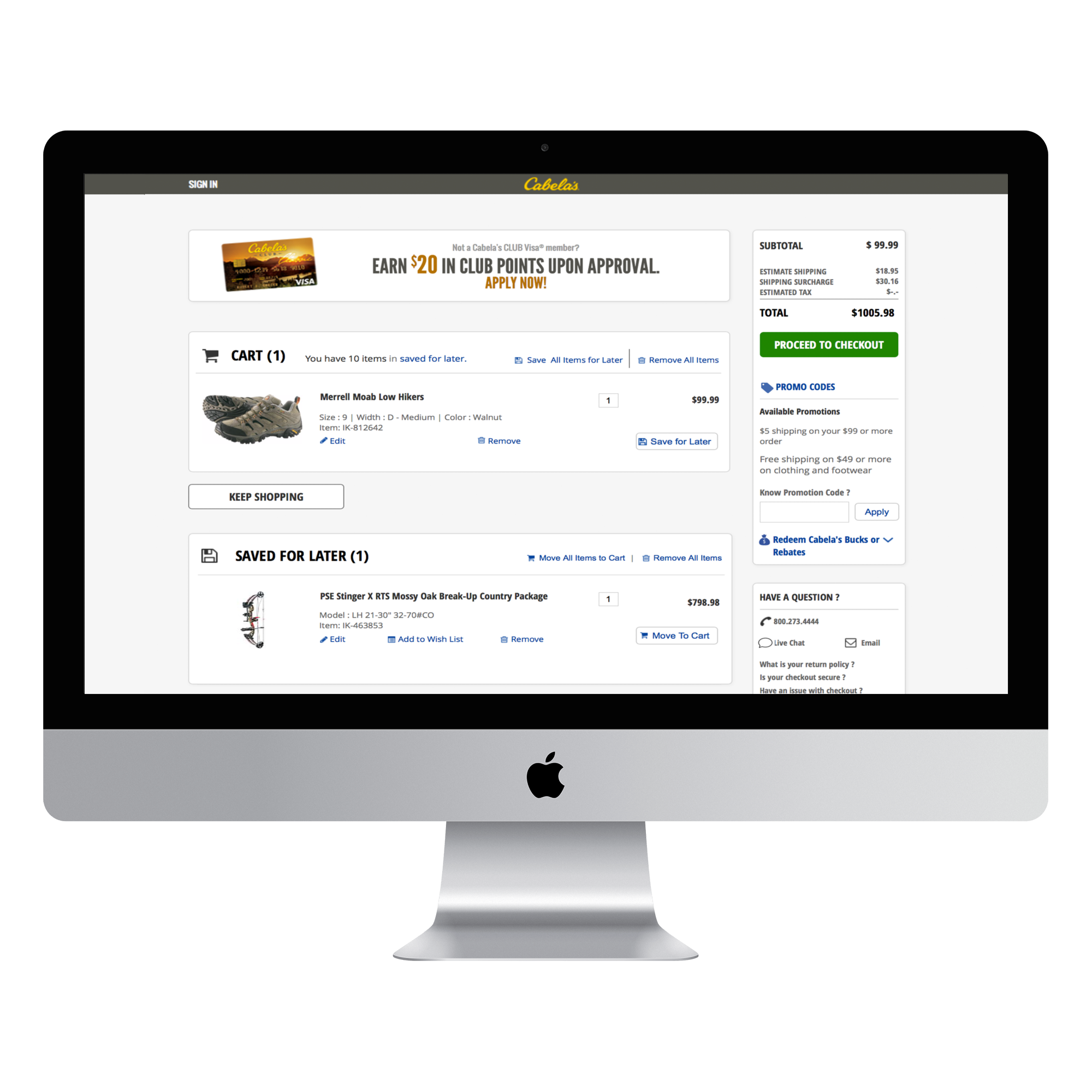
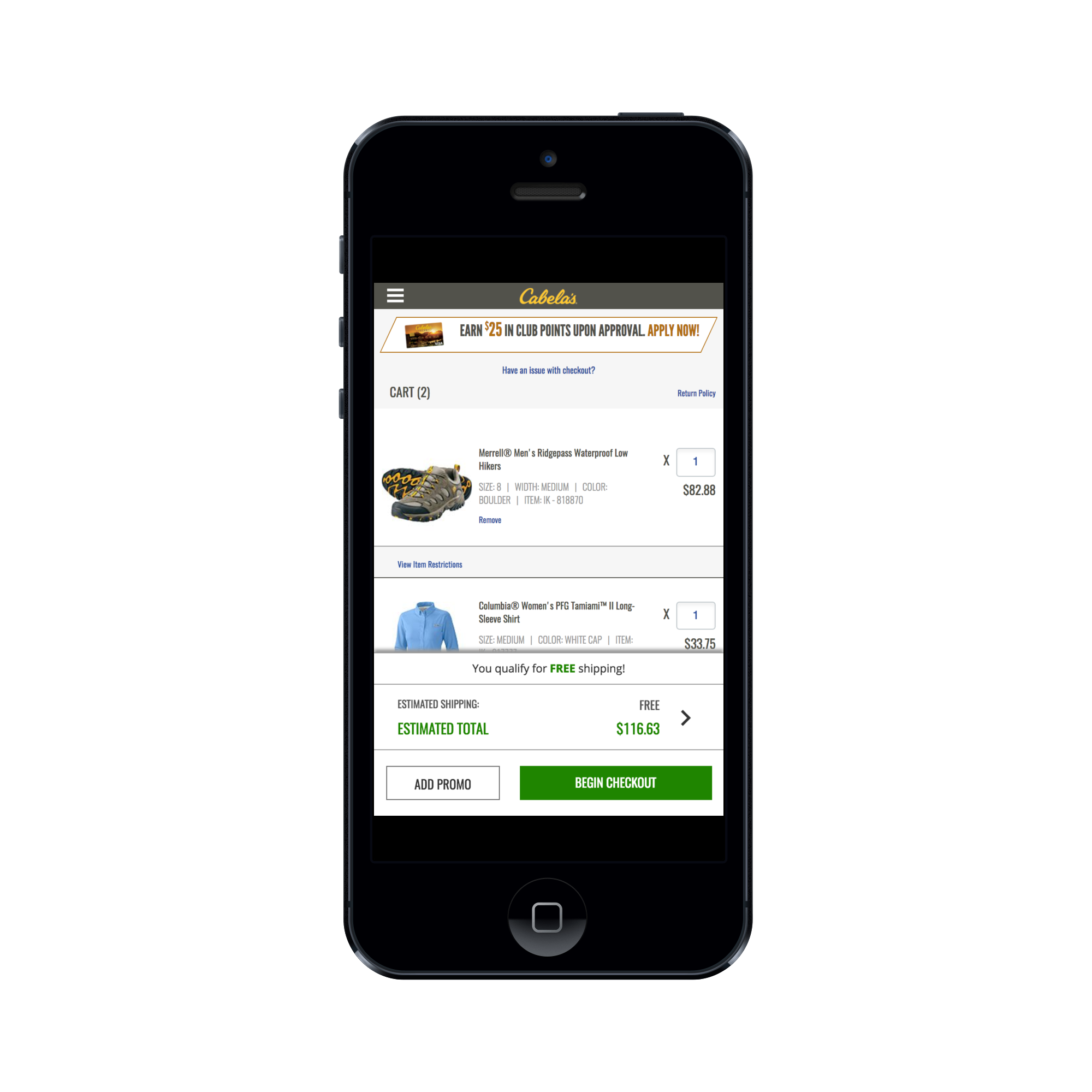
Cabela's Cart & Checkout
Cabela's

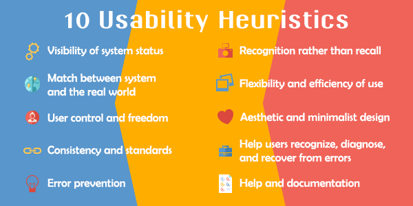
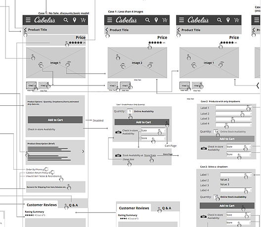
Heuristic Evaluation
Cabela's

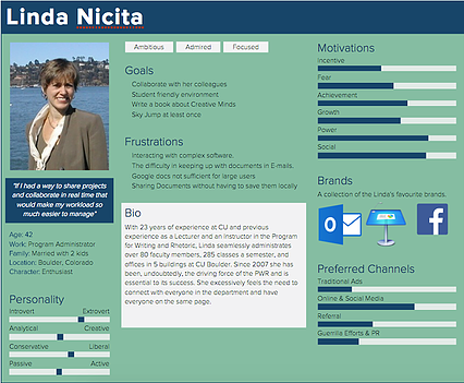
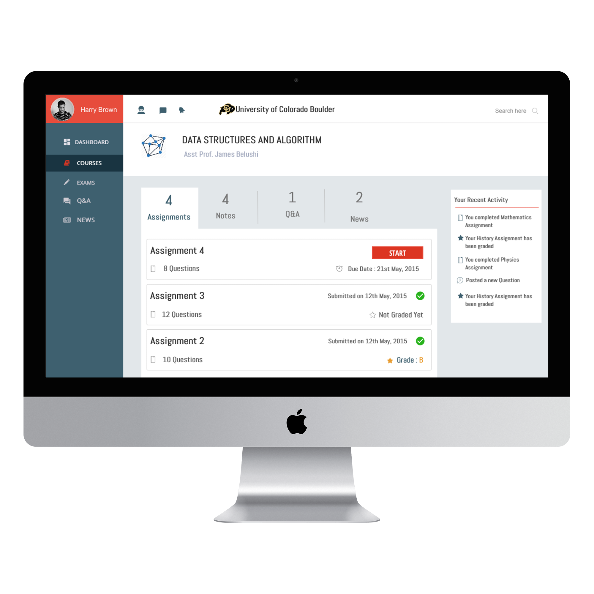
Course Dashboard
University of Colorado Boulder
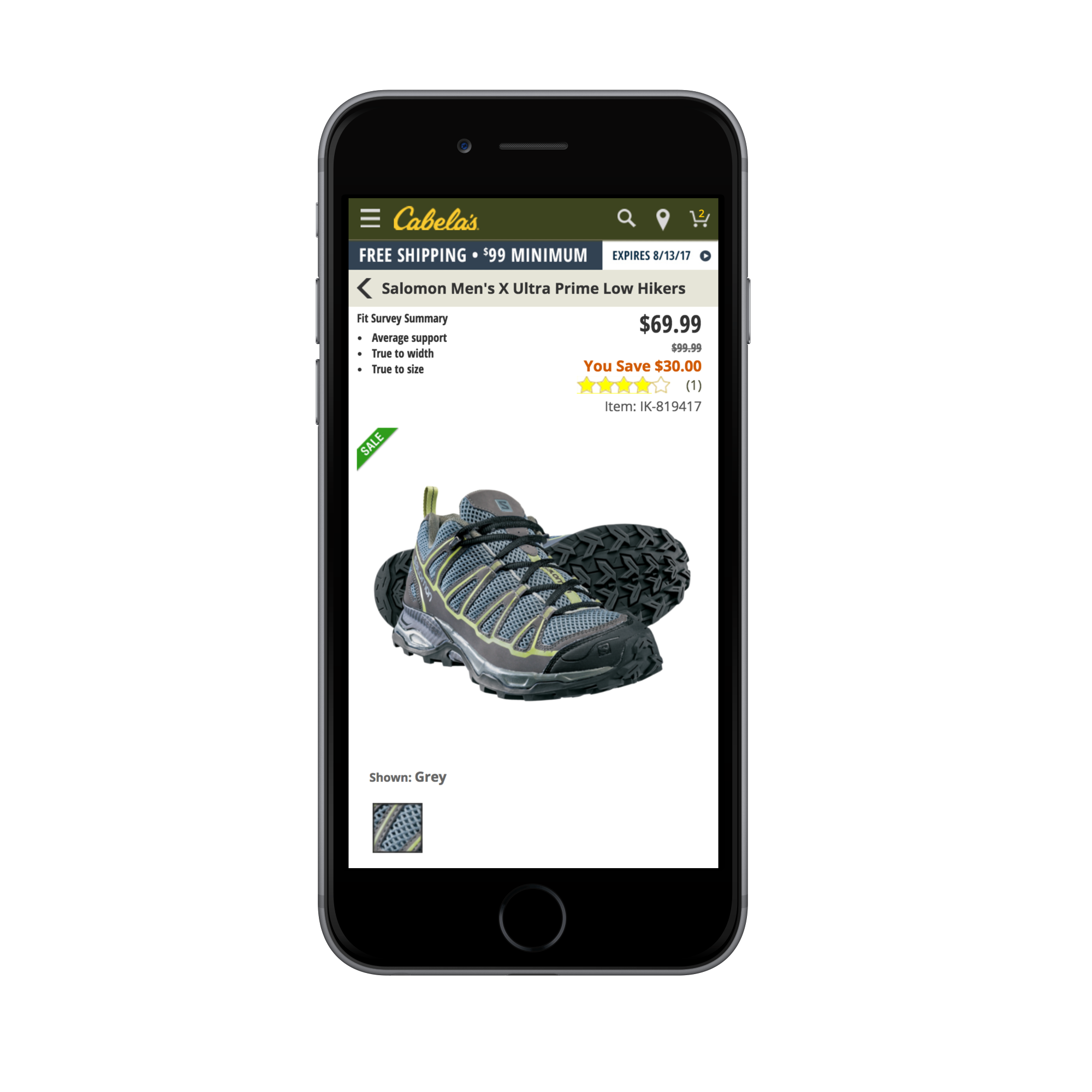
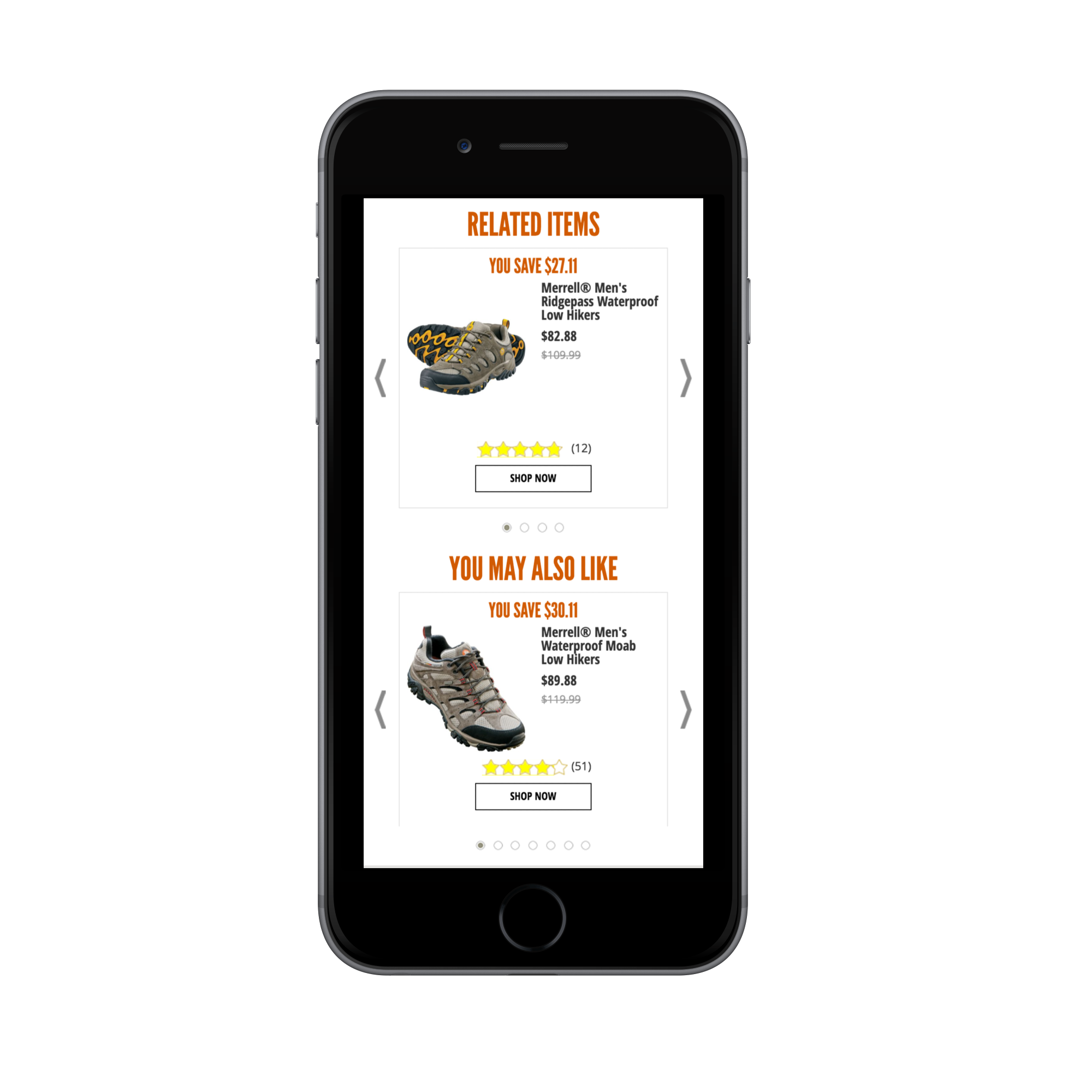
Product Page
For Cabela's Website
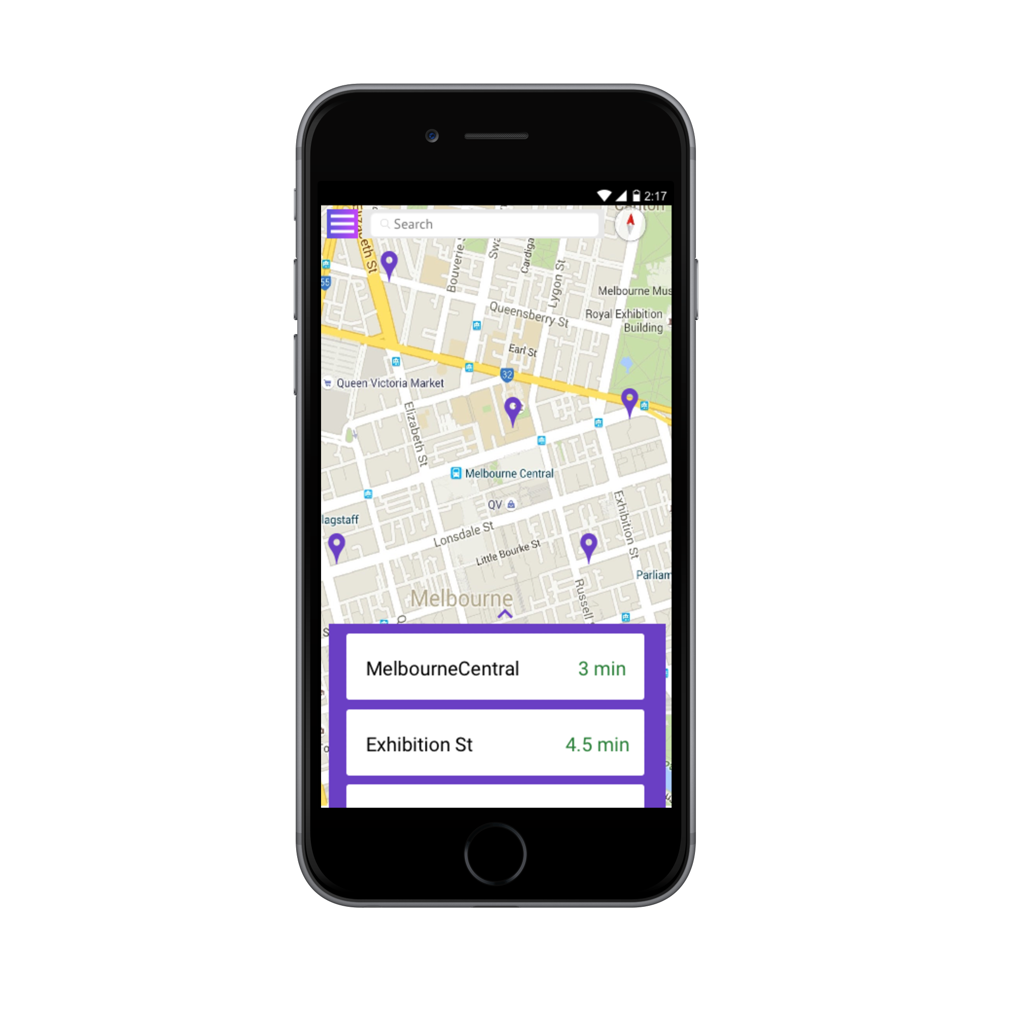
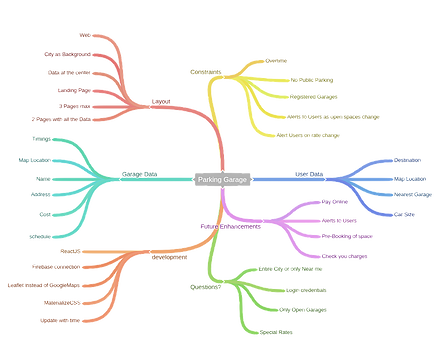
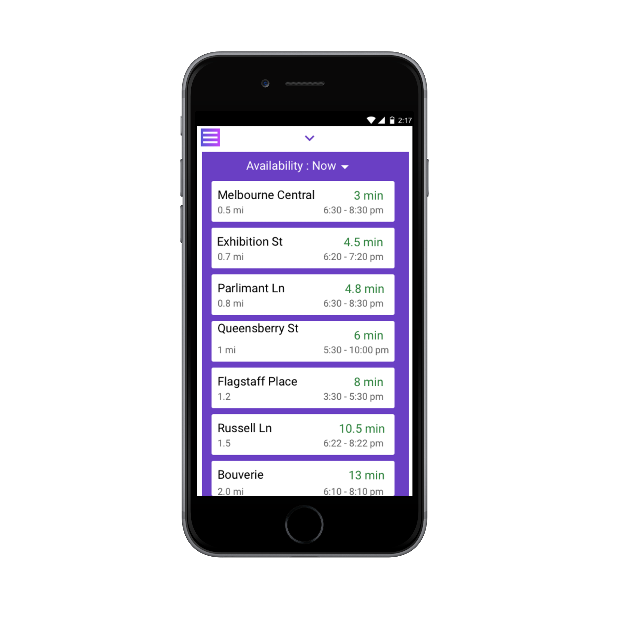
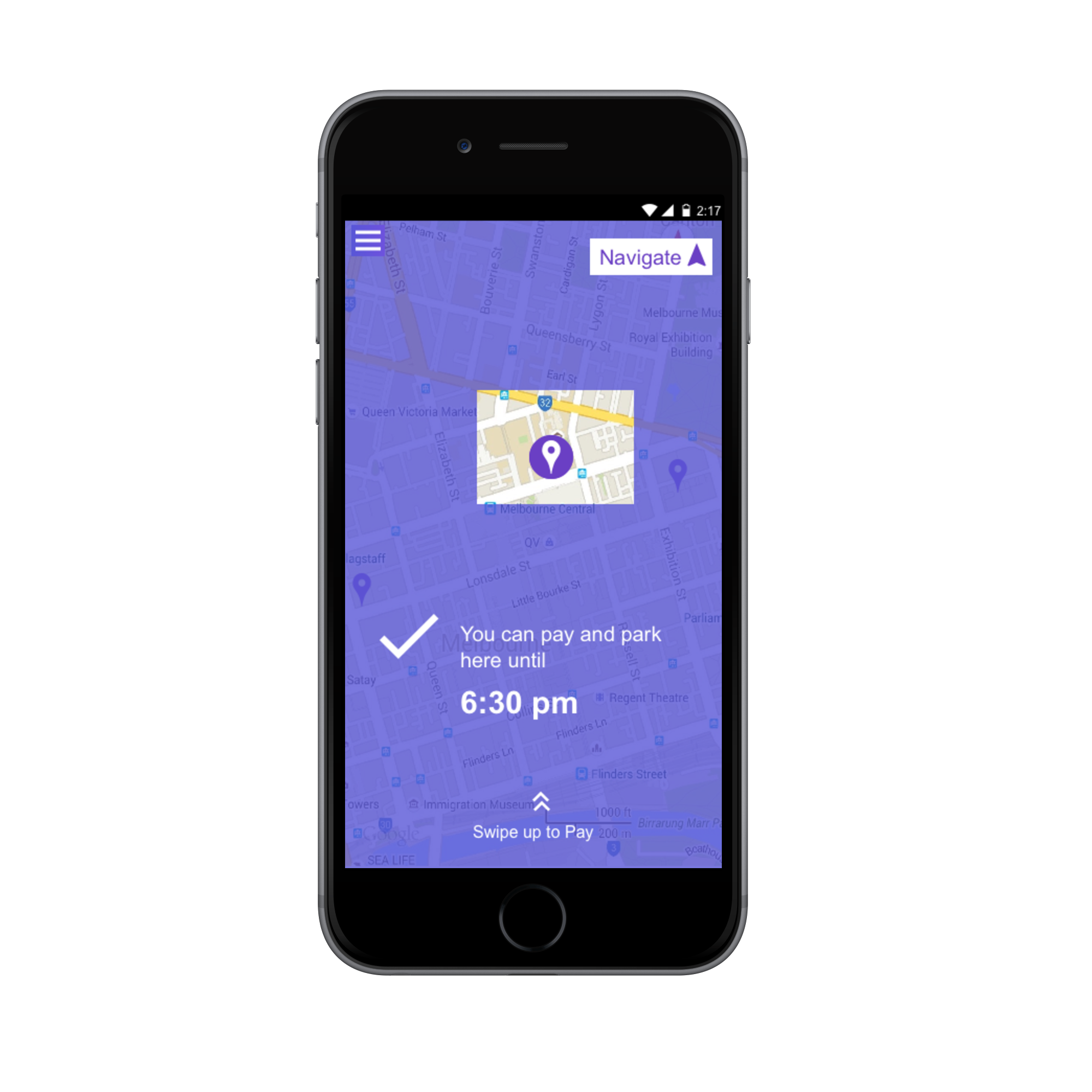
Parking Easy
Parking Spot Application
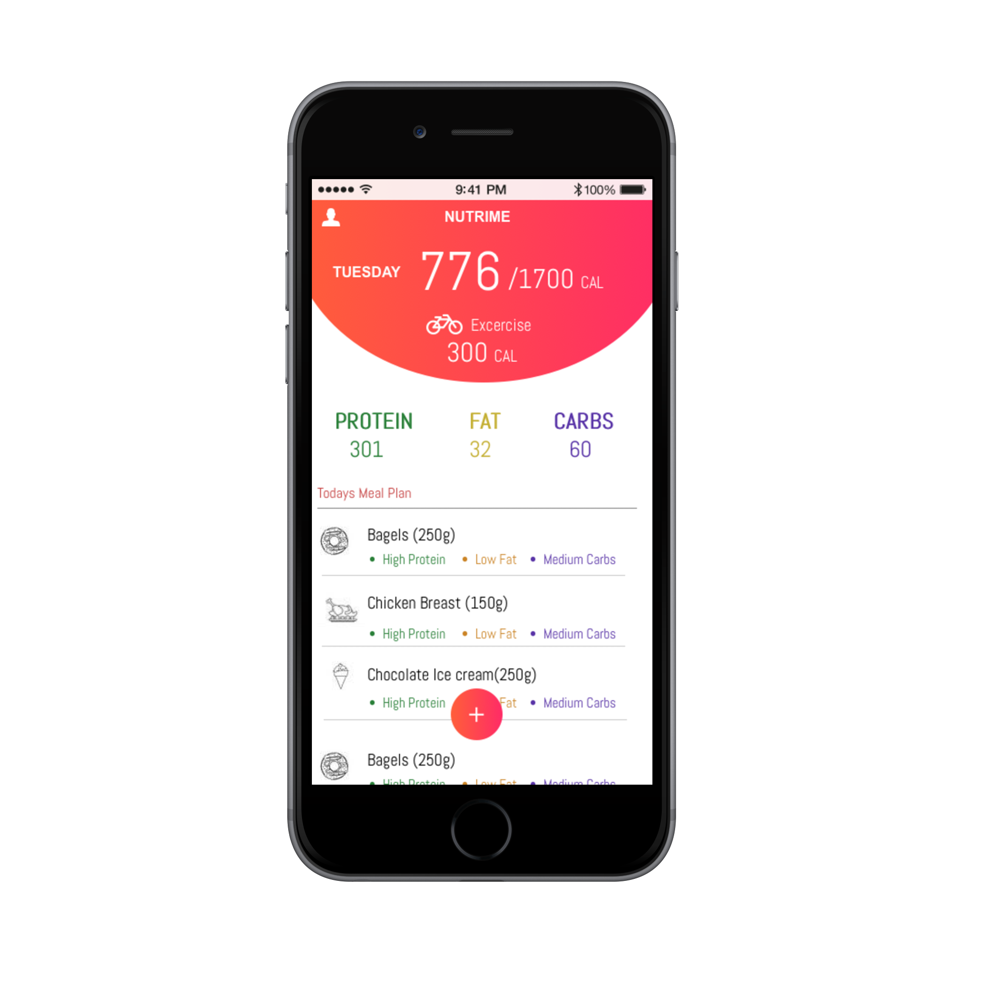
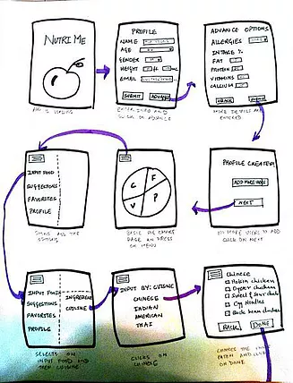
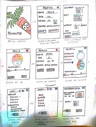
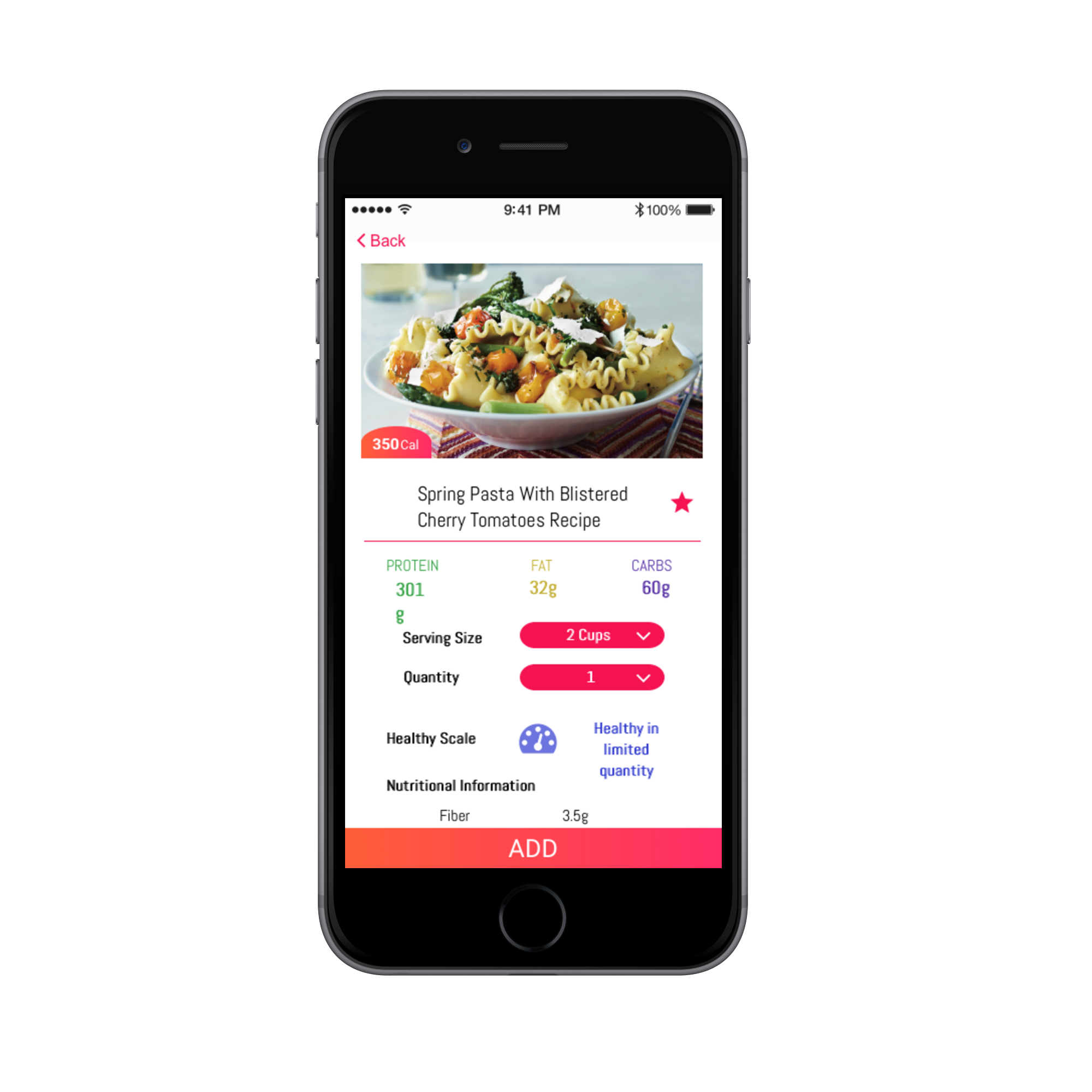
Nutrime
Health & Diet Application


.png)